

Organizing lesson content with an index
Luigi Bonafé is a History professor who created his education platform to teach specifically to aspiring diplomats, for the Admission Exam for the Diplomatic Career (CACD), a public entrance exam for the career in Brazil.
Problem:
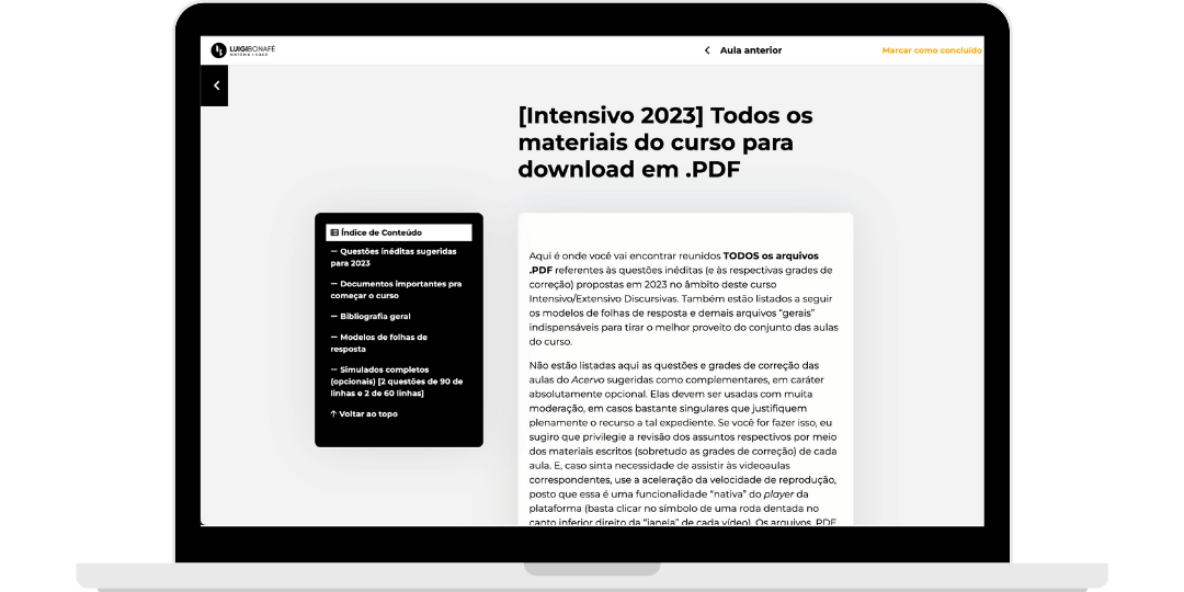
With various demands, one of the first ones we addressed was the organization of lessons. Unlike many of my clients who have shorter classes that were broken down, the History lessons for aspiring diplomats were long, with various added resources, videos, and references. Therefore, our task was to better organize the content for the students so that they wouldn’t miss any material.
Solution:
We went through several iterations of design solutions, and the chosen one was a floating index table that would automatically organize the contents, along with an improvement in the design of the classes.
Tech Stack:
- Everything was custom-developed.
Primeira etapa: propostas de soluções.
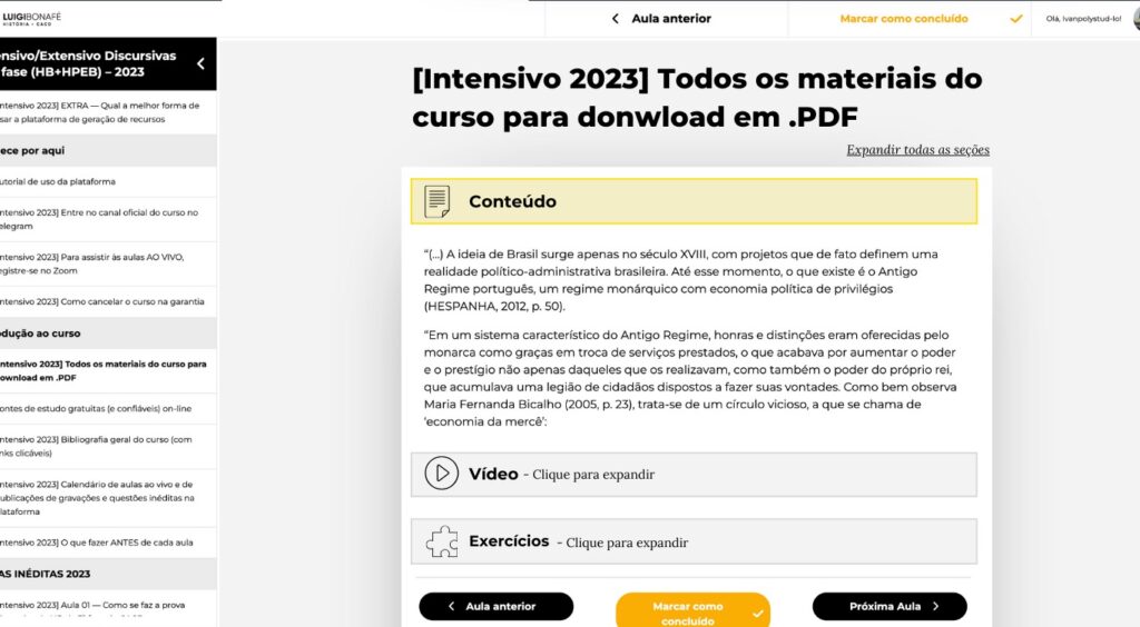
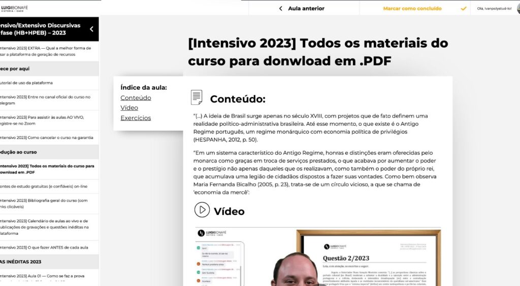
The challenge was tackled with a series of proposed solutions, each with its pros and cons presented to the client. Each proposal solved the problem, but the client also contributed their vision regarding the company’s branding and knowledge of how their audience would react. The final chosen solution was a floating index table.
The pros of the selected solution.
One of the advantages of this chosen proposal is that it would not require any effort regarding the content, as we developed a JavaScript code that identifies the lesson’s subheadings (h2, h3, h4…) and automatically adds them to a window positioned to the left of the lessons.
The Accordion solution would have the disadvantage in that a student could collapse some content and not realize it, thus losing sight of it if they were not paying attention. We could prevent this by making it obvious that it was a button; however, as it is a less common solution for education, we decided not to adopt it.
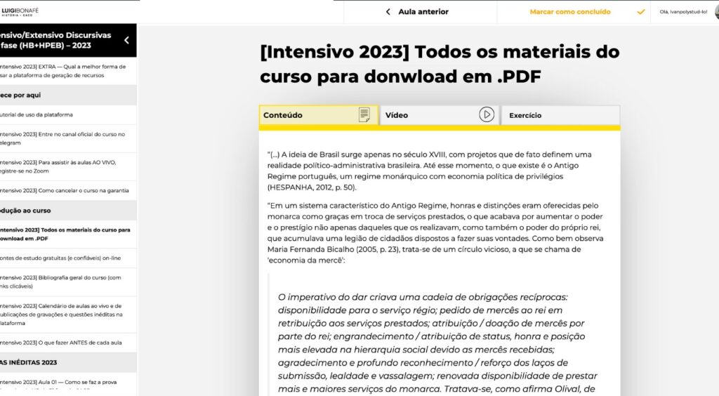
As for the tab solution, while elegant, it would require manual work from the administrator to tag all the course content sections.
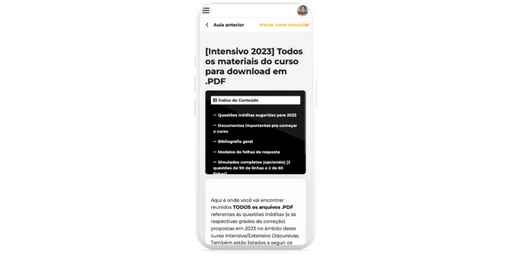
Here is the mobile version of the solution.
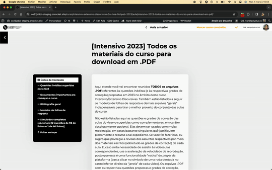
How we developed the solution.
We created a JavaScript code that identifies headings and adds them to a window, organizing them hierarchically according to the level of the titles (h3 headers within h2 headers). By default, the window is floating to the left of the content, following the scroll. However, the index remains at the top for mobile to save space.
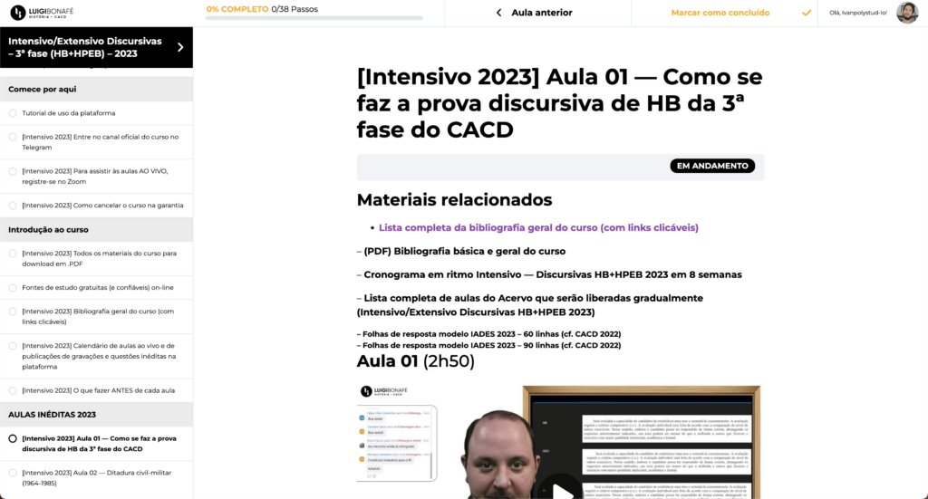
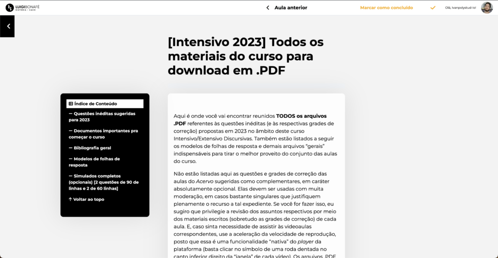
Additionally, we made some design modifications: the side panel of lessons was collapsed by default to provide more breathing area; we added a gray background to reduce reading strain, as there is a lot of text; we better separated the sections of the lessons to make it clearer for the student when one content ends and another begins; we removed unnecessary navigation elements so that the student could focus.
The before and after for comparison.
Let’s discuss your project
11 93618-5955